AVT 180 AleJandro Alvarez
Saturday, April 28, 2012
YOU ARE MY SUBJECTS (2005) by stanza RESPONSE
This project freaked me out a little bit...
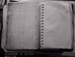
The premise is that there is someone always watching us, and while I have learned to accept that that is a reality it's still scary to think of how REAL it actually is. I think these are a series of pothgraphs taken with a security camera in New York City, without trying to target anyone in particular.
This project seems almost to be taken place in an Orwellian world, like the beginning of such world.
I know a lot of people that would be honestly scared of seeing how easy it is to access this information. I don't know what is the intent of the artist. Is he trying to critique the big brother or is he trying to make fun of all the people that are trapped inside this world?
FUCK YOU Cookie (2011) by Kim Asendorf RESPONSE
This one made me laugh a lot.
I don't fully understand the meaning of cookies in a computer. I just know that they are forms of stored data that just linger on in a computer. That is all I know about them.
I was again drawn to this particular work because of the title. I had no idea what I would find in something called FUCK YOU cookie. What really made me laugh was the absurdity of the text:
FUCK YOU COOKIES FOR FREE
You have just get the official "FUCK YOU" cookie!
It is the most beautiful cookie ever, and now it is yours! Send this
URL simply to all your friends, so that they can get a free "FUCK YOU"
cookie, too!
And it was represented in many languages as well. I actually sent this URL to some of my friends, they might think this is just spam of some sort.
I guess i liked this project because it was short and concise. it had an idea, and while its execution was not extremely complicated or the ideas represented are not extremely deep or meaningful, I would like to see just a big FUCK YOU sign posted somewhere in the city.
I guess i liked this project because it was short and concise. it had an idea, and while its execution was not extremely complicated or the ideas represented are not extremely deep or meaningful, I would like to see just a big FUCK YOU sign posted somewhere in the city.
Sunday, April 22, 2012
Artcrimes (2000) by Miklos Legrady RESPONSE
I was immediately intrigued by the title of this work. I thought it would be something like deforming conventional pieces of art that we all have seen into a way that would be offensive, thus the crime.
However, this work was more like a critique on the conventions of art. The piece of work is almost a complete website instead of just series of pictures or ideas. To understand the work, one must travel trough the website exploring and clicking the different sections of the website to find more content.
in the text that accompanies the work, the author seems to be making fun of the artistic conceptions that are created into art students in college. part of it seems to be the passiveness of audiences while looking at art.
This website seems to be achieving the complete opposite since it was really hard for me to understand what was begin said and just the simple navigation on a website, which is something I do everyday.
http://rhizome.org/artbase/artwork/2223/
Wednesday, April 18, 2012
Project 6: Mash up "Siamese Dream"
For this project I used the entire "Siamese Dream" album from the Smashing Pumpkins and put all the songs into one song.
This project was easy and simple and although I like the end product, I obviously prefer the original album any time of the day.
i could not understand how to use Audacity, so I ended up doing the mash up on Premiere Pro, which is a program that I am more familiar with.
The hardest part of the project was finding a good steady beat and lyrics. Since most of this album is so saturated, it was hard to find clean moments in which the sections that I wanted to use were easy to understand. At some point I placed to song by mistake, and I liked how they sounded.
I guess this project was more about intuition than skill with the mash up. One thing that I would like to re-do for this project is to show what songs are playing at what point. I didn't because since I know the album so well, I can easily identify what songs are playing.
Unfortunately.... not many people know "Siamese Dream" as well as I do
Unfortunately.... not many people know "Siamese Dream" as well as I do
Saturday, April 14, 2012
Collection Enlargement (2011) by Jonas Lund & Anika Schwarzlose RESPONSE
This project by Lund and Schwarzlose was really funny. I remember when the internet was starting to be available to everyone and the kind of messages that appeared then are similar to the ones that are being used in this art work.
It seems like the way this work was shown, was trough junk or spam E-mail. I think that while that is really funny, I don't think anyone who got these messages thought that it could be a work of art, or that it had a different purpose than just scamming people.
I think it's funny that they targeted collection collectors, just collectors, there is no specific types of collections that are being collected. I guess it says something about the culture of hoarding.
I really liked this project, it's short but it's effective and clear in its purpose.
/http://rhizome.org/artbase/artwork/53693/
Sunday, April 8, 2012
AVT Project 5 "The search for a Friend"
I guess it started when I saw a joke by the Nostalgica Critic and which he is singing and then stops to do something else while the music is still going. I pretty much ripped of that joke, but I still had to find a way to make work on this context.
I think i could agree that I was not able to do 1+1=3 all the time, but at least I was able to do a simple story using a video montage.
If I were to revise this project, I would make sure that the music is better synched up with the video. I would also like to make the "action shots" a lot more impressive, however as you can see on the last seconds of my project I suffered quite a serious injury in the process.
http://www.youtube.com/watch?v=kYTWxCMz-Mc
Saturday, April 7, 2012
( the photographic-diary project ) (2001) by Jimmy Owenns RESPONSE
I have been a little behind my blog entries, I usually start with
this week's entry, but this time I don't know what to call it.
http://www.dontstareatthesun.com/2001/photographic-diary/
~
This
video is one of those that I'm glad it comes with a description because
it I watched without it and I really didn't care to much for it. It
made me curious as to how the video was done. I almost wished it was
accompanied with a soundtrack, but then I was glad it didn't because I was able to play "Where is my mind" and that made the entire experience much more enjoyable. However, I understand that the artist might not have envisioned his project with "where is my mind" on the background, but I liked it that way.
Then I read the description and I guess it spoke to me in a different way. I have been trying to document all my performance and choreographic career. It has been really difficult to find everything and organise it in a coherent idea. All dance is mostly captured in video, almost never in photography. In the description Owenns describes this project of the collection of multiple photographs throughout the life span of a person. The idea of a video graphic journal seems really interesting to me, I don't think it could be helpful for me, because so very few photographers understand the kind of pictures that need to be taken in order to document dance properly.
The execution of this project seems include many elements. First you need to have a sequence of the photographs that makes sense, I think you need to create video of that sequence, then put it into a website that reacts to the roll over of the mouse, and then you need to make a video of all those things together.
I liked it !
http://www.dontstareatthesun.com/2001/photographic-diary/
~
Then I read the description and I guess it spoke to me in a different way. I have been trying to document all my performance and choreographic career. It has been really difficult to find everything and organise it in a coherent idea. All dance is mostly captured in video, almost never in photography. In the description Owenns describes this project of the collection of multiple photographs throughout the life span of a person. The idea of a video graphic journal seems really interesting to me, I don't think it could be helpful for me, because so very few photographers understand the kind of pictures that need to be taken in order to document dance properly.
The execution of this project seems include many elements. First you need to have a sequence of the photographs that makes sense, I think you need to create video of that sequence, then put it into a website that reacts to the roll over of the mouse, and then you need to make a video of all those things together.
I liked it !
Subscribe to:
Posts (Atom)


