Saturday, April 28, 2012

YOU ARE MY SUBJECTS (2005) by stanza RESPONSE


This project freaked me out a little bit...

The premise is that there is someone always watching us, and while I have learned to accept that that is a reality it's still scary to think of how REAL it actually is. I think these are a series of pothgraphs taken with a security camera in New York City, without trying to target anyone in particular.

This project seems almost to be taken place in an Orwellian world, like the beginning of such world.
I know a lot of people that would be honestly scared of seeing how easy it is to access this information. I don't know what is the intent of the artist. Is he trying to critique the big brother or is he trying to make fun of all the people that are trapped inside this world?

FUCK YOU Cookie (2011) by Kim Asendorf RESPONSE

This one made me laugh a lot.

I don't fully understand the meaning of cookies in a computer. I just know that they are forms of stored data that just linger on in a computer. That is all I know about them.

I was again drawn to this particular work because of the title. I had no idea what I would find in something called FUCK YOU cookie. What really made me laugh was the absurdity of the text:


FUCK YOU COOKIES FOR FREE
You have just get the official "FUCK YOU" cookie! It is the most beautiful cookie ever, and now it is yours! Send this URL simply to all your friends, so that they can get a free "FUCK YOU" cookie, too!
And it was represented in many languages as well. I actually sent this URL to some of my friends, they might think this is just spam of some sort.

I guess i liked this project because it was short and concise. it had an idea, and while its execution was not extremely complicated or the ideas represented are not extremely deep or meaningful, I would like to see just a big FUCK YOU sign posted somewhere in the city.


Sunday, April 22, 2012

Artcrimes (2000) by Miklos Legrady RESPONSE

I was immediately intrigued by the title of this work. I thought it would be something like deforming conventional pieces of art that we all have seen into a way that would be offensive, thus the crime.

However, this work was more like a critique on the conventions of art. The piece of work is almost a complete website instead of just series of pictures or ideas. To understand the work, one must travel trough the website exploring and clicking the different sections of the website to find more content.

in the text that accompanies the work, the author seems to be making fun of the artistic conceptions that are created into art students in college. part of it seems to be the passiveness of audiences while looking at art.

This website seems to be achieving the complete opposite since it was really hard for me to understand what was begin said and just the simple navigation on a website, which is something I do everyday.

http://rhizome.org/artbase/artwork/2223/

Wednesday, April 18, 2012

Project 6: Mash up "Siamese Dream"


For this project I used the entire "Siamese Dream" album from the Smashing Pumpkins and put all the songs into one song.


This project was easy and simple and although I like the end product, I obviously prefer the original album any time of the day. 

i could not understand how to use Audacity, so I ended up doing the mash up on Premiere Pro, which is a program that I am more familiar with. 

The hardest part of the project was finding a good steady beat and lyrics. Since most of this album is so saturated, it was hard to find clean moments in which the sections that I wanted to use were easy to understand. At some point I placed to song by mistake, and I liked how they sounded. 

I guess this project was more about intuition than skill with the mash up. One thing that I would like to re-do for this project is to show what songs are playing at what point. I didn't because since I know the album so well, I can easily identify what songs are playing.

Unfortunately.... not many people know "Siamese Dream" as well as I do

Saturday, April 14, 2012

Collection Enlargement (2011) by Jonas Lund & Anika Schwarzlose RESPONSE

This project by Lund and Schwarzlose was really funny. I remember when the internet was starting to be available to everyone and the kind of messages that appeared then are similar to the ones that are being used in this art work.

It seems like the way this work was shown, was trough junk or spam E-mail. I think that while that is really funny, I don't think anyone who got these messages thought that it could be a work of art, or that it had a different purpose than just scamming people.

I think it's funny that they targeted collection collectors, just collectors, there is no specific types of collections that are being collected. I guess it says something about the culture of hoarding.

I really liked this project, it's short but it's effective and clear in its purpose.

/http://rhizome.org/artbase/artwork/53693/

Sunday, April 8, 2012

AVT Project 5 "The search for a Friend"


I had a lot of fun with this project. I was surprised at how easily the idea came to my head and how close I came to actually achieving it.

I guess it started when I saw a joke by the Nostalgica Critic and which he is singing and then stops to do something else while the music is still going. I pretty much ripped of that joke, but I still had to find a way to make work on this context.

I think i could agree that I was not able to do 1+1=3 all the time, but at least I was able to do a simple story using a video montage.

If I were to revise this project, I would make sure that the music is better synched up with the video. I would also like to make the "action shots" a lot more impressive, however as you can see on the last seconds of my project I suffered quite a serious injury in the process.

http://www.youtube.com/watch?v=kYTWxCMz-Mc


Saturday, April 7, 2012

( the photographic-diary project ) (2001) by Jimmy Owenns RESPONSE

I have been a little behind my blog entries, I usually start with this week's entry, but this time I don't know what to call it.

http://www.dontstareatthesun.com/2001/photographic-diary/
~


This video is one of those that I'm glad it comes with a description because it I watched without it and I really didn't care to much for it. It made me curious as to how the video was done. I almost wished it was accompanied with a soundtrack, but then I was glad it didn't because I was able to play "Where is my mind" and that made the entire experience much more enjoyable. However, I understand that the artist might not have envisioned his project with "where is my mind" on the background, but I liked it that way.

Then I read the description and I guess it spoke to me in a different way. I have been trying to document all my performance and choreographic career. It has been really difficult to find everything and organise it in a coherent idea. All dance is mostly captured in video, almost never in photography. In the description Owenns describes this project of the collection of multiple photographs throughout the life span of a person.  The idea of a video graphic journal seems really interesting to me, I don't think it could be helpful for me, because so very few photographers understand the kind of pictures that need to be taken in order to document dance properly.

The execution of this project seems include many elements. First you need to have a sequence of the photographs that makes sense,   I think you need to create video of that sequence, then put it into a website that reacts to the roll over of the mouse, and then you need to make a video of all those things together.

I liked it !

Sunday, April 1, 2012

Proclaiming My Love (2010) by Justin Kemp RESPONSE

http://rhizome.org/artbase/artwork/53852/

THIS IS THE FIRST TIME THAT I HATE ONE OF THESE WORKS.

I hate because it's not at the same level of most of the other works that I have seen at rhizome. I don't understand what the artist is trying to say. I love the internet? I think there are many other ways of being creative and say the same thing.

This is why I feel like most people don't take new media art seriously. If this was my fist exposure to it, I would feel cheated, confused and annoyed. I think that audicences don't like to feel stupid or left outside of the joke.

I don't know, maybe I am not in the mood right now to understand this piece or work. Ususally, when I would find a confusing one or not so interesting one, I would look for something more interesting. But I hated this one so much that I actually wanted to write how much I hated it.

Saturday, March 24, 2012

Desktop Views (2012) by Adam Cruces RESPONSE


Whenever I sit with a friend to work on a project or something that requires both of to use our computers, I marvel at how different our uses and preferences with out computers are. This week's entry shows that almost everyone will have a different preference regarding their desktop and other aspects of their computers. I like to keep my desktop as clean as possible, with the minimum number possible of icons and as soon as I am done with some document, video or file, I put it into organized folders.

I think it's interesting that even something as simple as the desktop can be "art-fied". All these desktops are from new media artists, who probably spend a lot of time working with their computers and probably looking at the desktop. Customization for them must not only be for comfort, but also an expression of their artistry, it's like looking at the studios of traditional painters.

These are some of the desktops that surprised me the most, not only because of the background, but because they are able to merge both the interface, (Icons and other elements) with the background.
I would hate working on a desktop that has that many pictures on it. I just could not work like that.

Wednesday, March 21, 2012

Project 4: Still Animation Video


For this project I decided to play with a bunch of objects, but out of all the things that I used, my wallet seemed to acquire an interesting personality. I tried to keep it simple but I am actually happy with the result. Taking the shots was difficult when I was trying to hold the wallet in the air... that didn't work. It was a lot easier to put it on the table.

The music is Yoshimi Battles the Pink Robots Pt. 2
Somehow I think it goes well with the music.

Saturday, March 3, 2012

Project 3: Face Morphing


This project was a actually a lot of fun. I guess it's because I was so glad to be done with the previous project, that I welcomed any change. Joke aside, it was fun to make fun of people that I admire so much. All of these faces are extremely respected and admired in the world of Modern Dance. You can't really go that much higher, and yes, although there are many other important faces, These are the ones that have influenced me the most in my college career. I would have liked to use David Parsons as well but it was hard to find a nice simple clean head shot of him. As I'm looking at these pictures I realized that all the composites have Lar's haircut except for one.

 This is Lar Lubovitch. Artistic director of the Lar Lubovitch dance Company.
This man is Mark Morris, one of the most influential choreographers in George Mason University. Most of the faculty at the school of dance have danced for him in the past. He is the artistic director of the Mark Morris Dance roup
This lady will be refereed as lady T. She is the most amazing person I have met and I admire her so much. She is the most influential teacher I've had ever. I hope she never finds out that I used her face for this project.
These two pictures are the combination of Lar and Mark. I like the first picture although the nose seems to be completely attached, and yet  you can clearly see what parts of the face belong to whom, on the other hand the background of Mark's head shot made it difficult to truly blend them together. Mark does look better with more hair on his head.


 The second picture looks strange with the combined hair cuts,  it has a somewhat sad undertone to it, that I have no idea how I created.
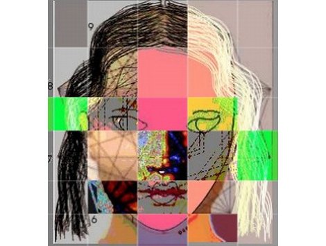
This is the one that gave me most trouble. Because lady T's picture is of lower quality than that of Lar. so whenever I blended these faces, Lar would seems to be wearing a weird make up. I tried giving him the female hair, but it never worked. I liked this one in the end because it ended up looking like a really strange cross dresses.

it's interesting to me as well, because the main dance company that Lady T worked for was Lar's


This man is the combination of all 3 pictures. I'm really proud of this picture because it does look like a real person. The main model is Lar's facial structure but with the outer lines of Mark. The rest of the body (neck) is that of Mark as well. I finally decided to put very few traces of Lady T to make it look strange, but I decided to just include some shadows that I think are caused by the difference in the quality of the pictures.
This picture is the one I like the most. I could only image what kind of genius would be if all the creativity of these 3 choreographers were to be combined as well.


"Your sFace or Mine?" (2004) by Reginald Brooks RESPONSE

I found this work be browsing in the archive of Rhizome and I was immediately caught be the fact that it seemed to be what we are working for our third project. In this project, the artist is placing the higher value on symmetry. I have heard before that the more symmetric our faces are, the more attractive we are. I guess I can't really argue that because to don't know how to prove that it's not.

I really like this concept because the artist has divided the human face into 30 different sections that are interchangeable with many images of the same body part, but with different colors or different textures. so that the user can create their own unique face. What I wish was different is the way the user selects the sections of the face. To change a part of the face, the user has to scroll a really nice and clever poem. every time the user rolls over a letter of the poem, the face changes.

I think that the poem really represents the concept of the work and lets us play god for a while. If god is trying to create the perfect human being, and the rules by which he can create such human are as confusing as the selection process in Brook's work, then no wonder the world is so messed up.

http://rhizome.org/artbase/artwork/26910/

Saturday, February 25, 2012

Absolut Net.Art (2001) by Eryk Salvaggio RESPONSE

http://rhizome.org/artbase/artwork/1690/


This week's art work actually made me laugh a lot.

I think Salvaggio really captured the essence of new media art (according to my definition anyway) because he found multiple ways to change a simple image of a very recognizable product. He used references to other artists, like Mouchette I wrote a blog entry on her a couple of weeks ago and it was satisfying to understand the reference to her and her work. One of my favorite representations of the bottle is this one :
~!        ~~~~~!!!!!!!!!MMMMMMMMMMMMMMMMMM$$M$$$MM!!!!!M$$M$M$MMMM!!!MM$$$$M$$$$$$$$$M$MMM$$$MMMMMMMMMMM!!!!!!!!!!!!!~~~~      ~~
~~        ~~~~!!!!!!~~~~~MMMMM~~~~~~~~~!!MM$$$MM~~~~~~~!!MM$$$M!~~~~~~~!MM$$$!!!!!!!$$$$$$M!!MMMMMM!!!!!!!!!!!!!!!!!!~~~~      ~!
~~        ~~~~!!!!!~~~~~~!MMMM~~~~~~~~~~~~!M$$~~~~~~~~~~~M$$M!~~~~~~~~~~~!$$$~~~~~~!M$M$$M~~~~~!MM~~~~~~~~~~~~~~~~~!!~~~       ~!
 !        ~~~~!!!!!~~~~~~!MMMM~~~~~~~~~~~~~~M!~~~~~~~~~~~MM$~~~~~~~~~~~~~~~MM~~~~~~!MM$$$M~~~~~!MM~~~~~~~~~~~~~~~~~!!!!~~      ~!
 !       ~~~~~!!!!~~~~~~~~!MMM~~~~~!M!~~~~~~M~~~~~~!MMM!!MM!~~~~~~!MM~~~~~~~$~~~~~~!M$$$$M~~~~~!MM~~~~~~~~~~~~~~~~~!!!!~~      ~!
 ~       ~~~~~!!!!~~~~~~~ !MMM~~~~~!MM~~~~~~M~~~~~~!M$$$M$M~~~~~ !MM$~~~~~~~M~~~~~~!M$$$$M~~~~~!MM~~~~~~~~~~~~~~~~~!!!!~~~     ~!
~!       ~~~~~!!!!~~~~~~~~~MMM~~~~~!M!~~~~~!M!~~~~~~~!M$$$!~~~~~~!M$$~~~~~~~!~~~~~~!M$$$$M~~~~~!MM~~~~~~MMM~~~~~!!!!!!!!~~     ~!
~!       ~~~~~!!!!~~~~!~~~~!MM~~~~~~~~~~~!MMMM!~~~~~~~~!M$!~~~~~~!$$$!~~~~~~!~~~~~~!M$$$$M~~~~~!MM~~~~~~MMM~~~~~!!!!!!!!~~     ~!
~!      ~~~~~!!!!!~~~~!~~~~~MM~~~~~~~~~~~!!MM$$M!~~~~~~~~!!~~~~~~!M$$!~~~~~~!~~~~~~!M$$$$M~~~~~!MM~~~~~~MMM~~~~~!M!!!!!!~~     ~!
~!      ~~~~~!!!!!~~~~M~~~~~MM~~~~~!M!~~~~~~$$$$M!!~~~~~~~!~~~~~~!$M$~~~~~~~!~~~~~~!M$$$$M~~~~~!MM~~~~~~MMM~~~~~!M!!!!!!~~     ~!
!!     ~~~~~~!!!!!~~~~!~~~~~MM~~~~~!MM~~~~~~MM$$$$$!~~~~~~!~~~~~~!MM$~~~~~~~M~~~~~~!M$$$$M~~~~~!MM~~~~~~MMM~~~~~M!!!!!!!~~     ~!
~!      ~~~~!!~!!~~~~~~~~~~~MM~~~~~!$M~~~~~~!!!!$$$!~~~~~~!!~~~~~~!$$~~~~~~~M~~~~~~!M$$$$M~~~~~!$M~~~~~~MM!~~~~~!!!!!!!!~~     ~!
!!      ~~~!!~~!!~~~~~~~~~~~!M~~~~~!!~~~~~~~!~~~!!!~~~~~~~MM~~~~~~~!!~~~~~~!M~~~~~~~!!!!!M~~~~~~!!~~~~~~MM!~~~~~!!!!!!!!~~     !!
!!      ~~~!~~!!~~~~~!!!~~~~~!~~~~~~~~~~~~~!!~~~~~~~~~~~~!$$!~~~~~~~~~~~~~!M$~~~~~~~~~~~~M~~~~~~~~~~~~~!MM!~~~~~!!!!!!!!~~     !!
!!      ~~~~ ~!!~ ~~~!~!~ ~~~!~~~~~~~~~~~!!MM~~~~~~~~~~!M$$$$M~~~~~~~~~~~!!!M~~~~~~~~~~ ~M!~~~~~~~~~~~!MMM!~~~~~M!!!!!!!~~     !!
!!      ~~~!~~!!~~!~~!!M!!!!!!!!!!!!!!!!!$$M!M!~!!!!!!MM$$$$$$M!!!!!!!!!!!!~$!!!!!!!!~~!!M$!!!~~~~~~~!MMM$~~~~ ~!!!!!!!!~~     !!
!!      ~~~!~~!! ~!~!!!MMMMMM$$M$M$$$$$$$M!~!$!~M$$M$$$$$$$$$$$$$MMMM$M~~!!MMMMMM!MMM ~$M$$$$M!!!!!!MM$M$M~!!!!!!!!!!!!!~~     !!
!!~     ~~~!!!~ ~!!!!!MMM!MMMMMMM$!M$!!$$! ~M$ !$$$MM$$$$$$$$$$$M!!!$M~~!!$$!~!!M!~~!~!$$MM$$MM!!M$MMMMMM~!MMMMM!!!!!!!~~~     !!
!!     ~~~~!!!~ !!!MMM!!!~!! ! !!!! !! $!~!$!!~~$M!! MM~M$$$$$!~MM~!! !M$$!~$$$$$~!~M !!M!M$ !~~M!~!!!~! !!~~~! ~~~!!!!!~~     !!
!!     ~~~~!!!~ !!!M!! !!~!!!!~!!M~!M ~!~!MM!!~!!!!~!!~!MM$$M!~!M!!!~~MMMM~!$$MM!MM!M !M!~M!!M~~!~!!!~!!~!~~~!!~~~~!!!!!~~     !!
!!     ~~~!!!!~ !!M!!  !~M~~! M!M!!$!!M ~M!!! M!MM !M ~!!M$$~~!M!!$~  ~!M$ !$M!!M$$M~!$~~M~ M!M! MM! M!~M!!M~!!~! !!!!!!~~     !!
~!     ~~~~!!!!~~!~!!!~!MM!!M!!M!!$M!!MM!!MMM!!M$M~! ~!$$$!M$!!!$$!~!~M$M$M~!~M$$$! ~$$!!!!~!M$M!!!M~!!~!~!!M! !~!!!!!!!~~     !!
!!~    ~~~~!!!!!!!!!MMMMMMMM$M$$M$$$$$$MMM$M$M$MM!! ~M$$$$$$$$M$M!~M$!$$$$$!!~!!!!!MM$$MMMMMM$$$MMMMMMMMMMMMMM!M!!!!!!!!~~     !!
!!     ~~~!!!!!!!!MMMMMMMMMMM$$$MMM$MMM$MM$MM!!!!!!~M$$M$$$$$$$$! ~$!M$$M$!!M$$$$$$$$$$M$$M$$$$$$$$$MMMMMMMMMMMM!!!!!!!!~~     !!
!!     ~~~!!!!!!!!MMMMM!~~~ ~MM$M~~~~~~$M~~~~~ ~   M$$$~ ~~~~~~~  !!!$$$!~~~~~!$$$M!!!!!!MM$$$!!!!!!!MMM!!!MMMMMM!!!!!!!~~~    !!
!!     ~~~~!!!!!!!MMMMMM~~~~~!$$!~~~~~!!~~~~~~~~  ~~M$$~~~~~~~~~   ~!$$$!~~~~~!$$M~~~~~~!M$$$$~~~~~ ~MM!~!!!MMMM!!!!!!!!~~     !!
!!     ~~~!!!!!!!!MMMMMM!~~~~!$$~~~~~~!~~~~~~~~~~~~~~$$~~~~~~~~~~~~~~!M$!~~~~~~$$! ~~~~!$M$$$$~~~~~~~!M!~!!!MMMM!!!!!!!!~~~    !!
!!     ~~~!!!!!!!!MMMM$$!~~~~~$$~~~~~!!~~~~~!MM!~~~~~!$~~~~~~~!!~~~~~~!$!~~~~~~$$ ~~~~~M$$$$$$~~~~~~ ~$M!!~!MMMMM!!!!!!!~~~    !!                      
!!     ~~~!!!!!!!MMMMMM$M~~~~~$$~~~~~!~~~~~~M$$M~~~~~~M~~~~~~~$$!~~~~~~M!~~~~~~M!~~~~~!$$$$$$!~~~~~~~~MMMMMMMMMM!!!!!!!!~~~    !!
!!     ~~~!!!!!!!MMMMMMM$~~~~~MM~~~~~!~~~~~~$$$$~~~~~~!~~~~~~~$$!~~~~~~!!~~~~~~!~~~~~!M$$$$$M~~~~~~~~~!M$MMMMMMMM!!!!!!!~~~    !!
!!     ~~~!!!!!!MMMMM$MM$~~~~~M!~~~~!!~~~~~~$$$$~~~~~~!~~~~~~~$$M~~~~~~!!~~~~~~~~~~~~$$$$$$$!~~~~~!~~~~MMMMMMMMM!!!!!!!!~~~    !!
!!     ~~!!!!!!!MMMMMM$$$!~~~~!~~~~~!!~~~~~~M$$$~~~~~~!~~~~~~~$$M~~~~~~!!~~~~~~~~~~~~M$$$$$$~~~~~!!~~~~!MMMMMMMM!!!!!!!!~~~    !!
!!     ~~!!!!!!!MMMMMM$$$M~~~~!~~~~!M!~~~~~~$$$$~~~~~~!~~~~~~~$$M~~~~~~!!~~~~~~~~~~~~!$$$$$$~~~~~!M ~~~~$MMMMMMM!!!!!!!!~~~    !!
!!     ~~!!!!!!!MMMMMMM$$$!~~~~~~~~!$M~~~~~~$$$M~~~~~~!~~~~~~~$$!~~~~~~M!~~~~~~M!~~~~~!$$$$M~~~~~MM~~~~~MMMMMMMM!!!!!!!!~~~~   !!
~!     ~~!!!!!!!MMMMM$$$$$!~~~~~~~~M$$!~~~~~MMM!~~~~~!M~~~~~~~MM~~~~~~~M!~~~~ ~M$~~~~~~$$$$!~~~~~~~~~~~~MMMMMMMM!!!!!!!!~~~~   !!
~!     ~~!!!!!!!MMMMM$$$$$$~~~~~~~!$$$M~~~~~~~~~~~~~~M$~~~~~~~!~~~~~~~~$!~~~~~~$$~~~~~~!$$M~~~~~~~~~~~~~!MMMMMMM!!!!!!!!~~~~   !!
!!     ~~!!!!!!MMMMMMM$$$$$!~~~~~~M$$$$!~~~~~~~~~~~~!$$~~~~~~~~~~~~~~!M$!~~~~~~M$!~~~~~!M$!~~~~~~!!~~~~~~M$MMMMM!!!!!!!!!~~~   !!
!!     ~~!!!!!!MMMMMM$$$$$$!~~~~~~M$$$$$!!~~~~~~~~!!M$$~~~~~~~~~~~~!!$$$!~~~~~~M$$!~~~~~!M~~~~~~!M$!~~~~~!MMMMMMM!!!!!!!!~~~   !!
!!     ~~!!!!!!MMMMMMM$$$$$M!MMMMM$$$M$M!!~ ~ ~!!M$!M$$!!!!!!!!!!MM$$$$$!!!!!~!M$$M~!~~~~!~~~~~~MM$M!~~~~~MMMMMMM!!!!!!!~~~~  
It's It's Definetely a visual representation using only text. I think it's brilliant.
                                          

Monday, February 20, 2012

Project 2 "Cut and Paste"

I think totally failed this project. Not only because I am not technically proficient with Photoshop, but because creatively I could not come up with an interesting enough concept.

Obviously my inspiration were the actual movie poster for Star Wars. I wanted to create one that could tell the story of the next episode in the star wars series... Because I ahve always wondered what kind of world and story it would be after "The Return of the Jedi"

I really don't like the end result of this project. I hope I can do better on the next one.

I was really upset about it, and then my friend reminded me that it is okay to produce crap when we are new in a medium. I am upset about my silly idea, but hey, the first 3 pieces that I ever choreographed also sucked, so yeah.

I think the reason why it's not working it's because the pictures don't relate to each other. they just seem to be there and they don't tell any kind of story, which is what movie posters are all about.  I didn't realize how important it was to have an interesting background. although the all black background made things easier, it also limited the the interaction that the pictures could have with each other.

Friday, February 17, 2012

“Almost Home” by Arturo Herrera 2001 RESPONSE


For this week’s entry, I finally found something like I have been looking for.  Except that I still feel confused by it. This piece is called “Almost Home” by Arturo Herrera. I like it even though I don’t understand it perfectly. The point of the piece, is have the audience, match two different panels with images that hints towards childhood icons. All of the images are altered and at times they seem to be vandalized. One of the funniest, that I found, is just the foot of Donald the Duck, just the foot and still perfectly recognizable.

The images are randomly generated and the user is forced to change one at the time. This make me feel out of control even though I was free to choose which one to change. What I liked abut it though, is that I was forced to look at every combination of images with it’s own composition value.  I think that if the artist had had only one picture at a time, it would have not been nowhere near as effective as it is on “Almost Home”

I had never seen art presented in that way on the web. It’s a really cool idea.

Saturday, February 11, 2012

Flesh&Blood (1998) by Mouchette RESPONSE

One thing that I really like about rhizome, is that I never know how the heck I got to the piece of work that I decide writing about. This is the third time I search for an article and every time I feel more comfortable writing about it. I used to want to find a photograph or a video or an animation. This time I found a whole website (granted, the website is not too long) that made me uncomfortable, curious and a little scared at the same time.

This website is the home page of a (at the time of publication) 13 year old girl called Mouchette. It features really close shots of this girl's body, mostly only part of the body that are connected to the sense; tongue, eyes, ears lips and mouth. I don't think that the photography is particularly interesting, but combined with the text and the crappy interface, it made me feel like I was in a world of sick pornography. It was like I was watching someone expose herself in a way that was dehumanizing... I don't know it really confused me for a while.

Once I got over my initial shock, I realized that I was looking at parts of the human body that I see everyday, all the time. Lips and ears are accepted in my culture as well as in the U.S. then why did it freak me out so much? Was it the fact that it was the body of a 13 year old girl? Would my feelings and reactions had been different if it was a boy's body? an old person? I don't know... Perhaps it's just the close up of the picture and the text, prompting me to do something with that body part.

There is this other part of the website that I could no longer experience because the website is so old and probably out of maintenance. Most of the pages, asks you a question about that picture that you are seeing like "what do my tongue tastes like"? then you write your answer and send it in an E-mail. The system is supposed to reply to you. I wish I had gotten a response, just to experience the whole of the artistic intent.

It's not like I'm afraid of other people's body: As a dancer, I get male and female groins in my face all the time. I get in close contact with people's bad breath, sweat, sometimes blood. I  mean I think I have a good relationship with my body as well as others'. So what is it that really freaked me out so much? I think it's that i was not expecting it, that fact it was a 13 year old girl or maybe the whole "my parents are ok with me doing this" kinda persona she was wearing.

Anyway... it was interesting.


http://rhizome.org/artbase/artwork/1692/